Case StudySwimlane Turbine
SaaS platform modernization.
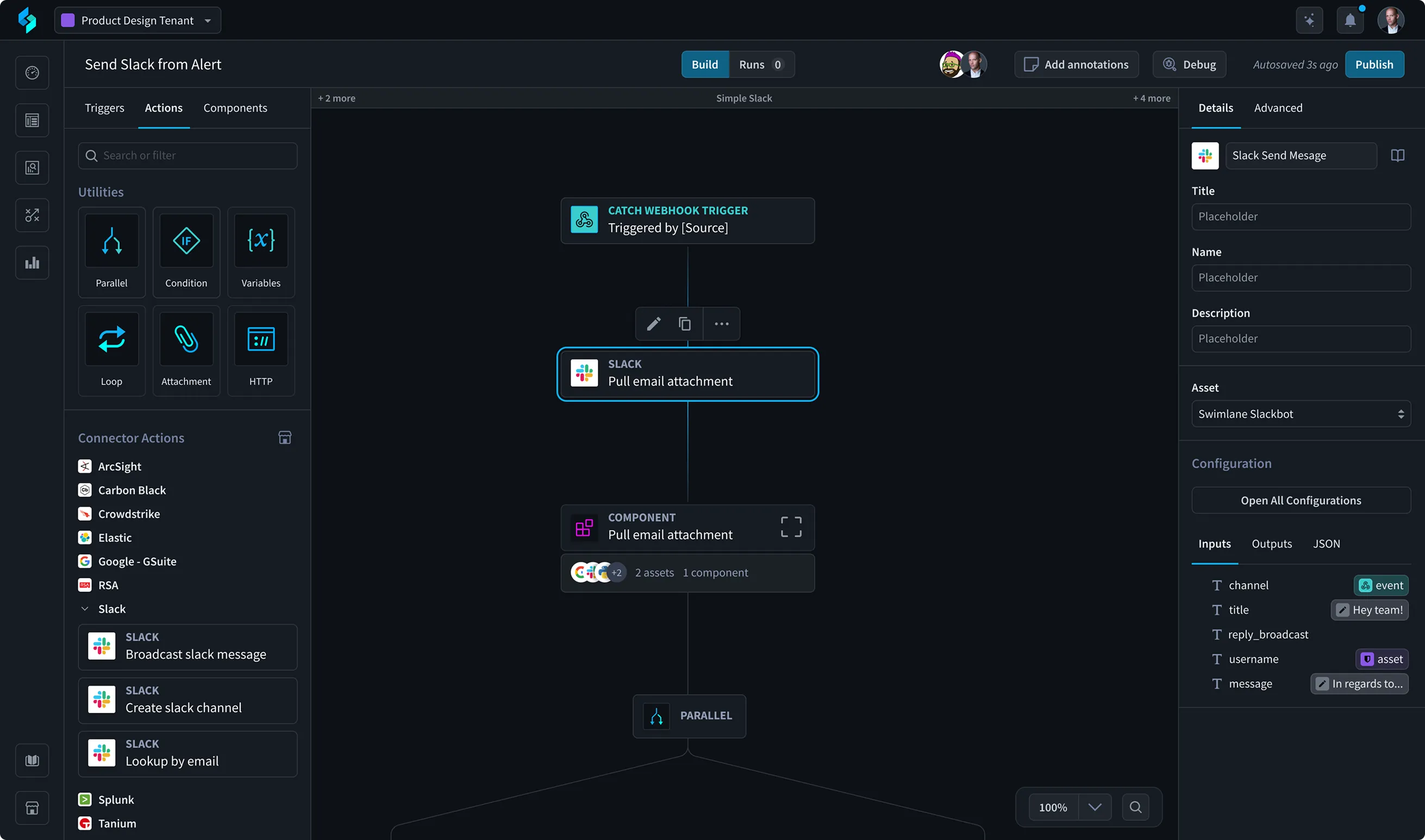
The platform suffered from fragmented user experiences, inconsistent UI, and growing technical debt due to rapid feature expansion. That compromised usability and scalability just as new competitors entered the market.
TL;DR
A cross-functional effort to establish a "north star" UX vision.
I led a cross-functional effort to establish a "north star" UX Vision, aligning Product, Design, and Engineering around a scalable design system while strategically integrating AI-powered experiences to future-proof the platform. Key focus areas included accelerating time-to-value, enhancing usability, and achieving platform-wide consistency.
What I did
- Design System Leadership: spearheaded a design system audit (95% coverage) and rollout strategy, establishing a hub-and-spoke model that cut average time-to-decision by 18% across the product development lifecycle.
- Strategic Prioritization: introduced a prioritization framework that balanced short-term wins with long-term modernization, guiding initiatives like AI Integration, Notifications, RBAC, and Navigation.
- Impactful Redesigns: led end-to-end design for major feature areas, including a comprehensive dashboard redesign that enabled 35% faster dashboard creation and decreased edit/configuration errors by 20% in user testing.
- AI/ML Integration: deeply involved in designing core AI data flows and agents, including action policies and data models to enable scalable AI/ML automation.
Impact
- Operational Efficiency: 18% reduction in average time-to-decision for product development.
- User Productivity: 35% faster dashboard creation, 20% decrease in configuration errors.
- Customer Support Reduction: support tickets related to dashboards dropped by 19%.
Context
Background
Swimlane Turbine is a Security Automation platform that enables enterprise Security teams to establish, automate, and scale their security programs. The platform attracts customers with its flexibility to integrate with various tools, but this flexibility introduced growing complexity. Its core audience was Security Analysts, with many users contributing from DevOps teams who relied on the platform's low-code scripting and API integrations to customize automation workflows. I led design of interfaces supporting use cases like writing and debugging Python-based automation scripts, managing JSON configuration files, and viewing system logs and debugging outputs.
Problem
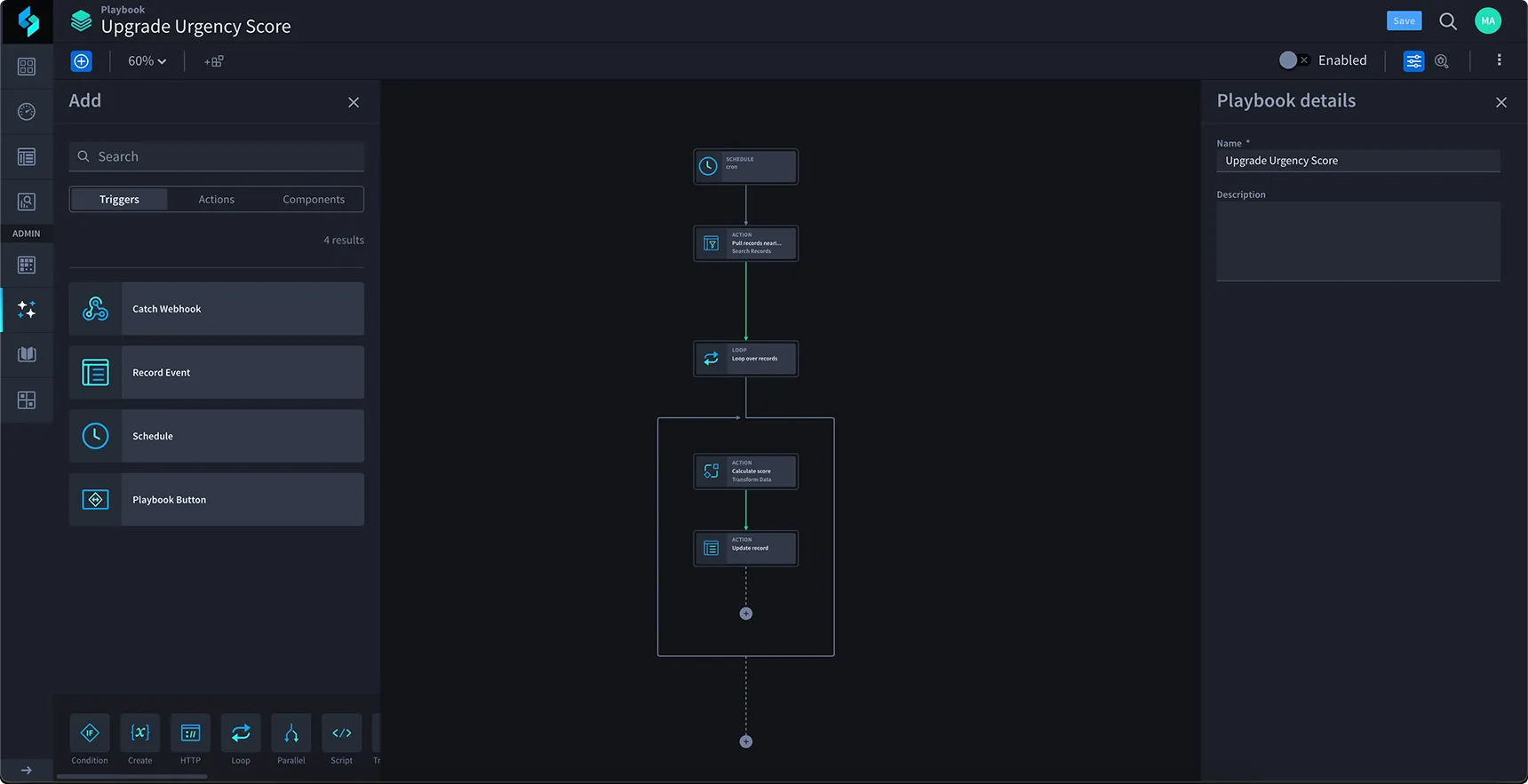
As the platform rapidly added features, the design foundation wasn't maintained. This pattern resulted in fragmented user experiences and inconsistent UI patterns across the product, creating increased cognitive load for users and growing technical debt. The product's usability and scalability were being compromised, and new competitors were entering the market with more modern, consistent user experiences.
Process
From a north star vision to a redesigned dashboard.
01
Setting the north star
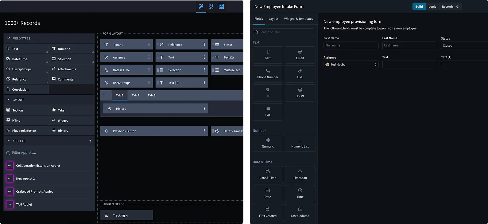
I developed and presented a "north star" UX Vision to leadership that aligned product, design, and engineering around a scalable design system while introducing AI-powered experiences to future-proof the platform. It focused on:
- Faster time-to-value for security workflows
- Improved usability and onboarding
- Platform-wide design consistency
- Positioning for AI-driven automation
The vision applied the new component system and proposed IA changes across the product, including the Application Builder:
02
Rolling out the design system
I led a cross-functional design system audit and rollout strategy by conducting a comprehensive component audit alongside Engineering and Product teams, uncovering 95% coverage across the application. To streamline modernization, I established a hub-and-spoke model where front-end engineers collaborated directly with my design team on component updates, complemented by weekly QA reviews led by principal UI developers to ensure consistency. This effort improved velocity, consistency, and handoff quality, and it led to higher confidence in my team to execute and think about larger workflows rather than individual features.
A fully centralized model, with one dedicated team owning every component, was the more conventional choice, but it didn't fit our reality. My design team was small and nimble, with no bandwidth to support a dedicated systems owner, and the system itself was still fledgling when I joined. Hub-and-spoke let my team and senior UI architects meet regularly to build and review core components at an atomic level together, while individual designers could still build specialized, one-off components for edge cases without bottlenecking on a single team. That resourcing reality is what won buy-in from both engineering and product leadership.
03
Prioritizing across product silos
Due to the siloed nature of the Product Management organization, I noticed significant overlap in proposed features and vague direction in various product requirement documents (PRDs). To address this, I introduced a prioritization framework that evaluated all design opportunities based on business impact and technical feasibility. Done in close partnership with Product Management leadership, this let us create a unified, phased strategy that balanced high-value, short-term wins with long-term modernization goals, ensuring all PMs and designers were aligned on a shared mission. These initiatives tied back into the North Star vision, including:
- AI Integration: designed user-friendly workflows for AI-driven processes (see the Hero AI case study)
- Notifications: built a centralized, flexible system to support alerts, tasks, and escalation
- Primary Navigation: restructured navigation for scalability and clarity; introduced IA improvements
- RBAC: streamlined complex role/permissions UX for both Admins and end-users
- MSSP Support: designed multi-tenant experiences supporting separation and oversight
Each initiative involved a full design process, including research, stakeholder interviews, information architecture, component system updates or creation, prototyping, and user testing. These were large, complex efforts, each taking 3+ months to define, architect, design, and deliver. The result was a noticeable increase in product delivery speed and improved engineering execution, ultimately accelerating value to customers.
04
Redesigning dashboards
The dashboard redesign is an example of the design process each initiative went through.
Research
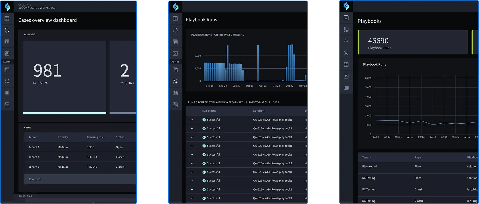
I led a comprehensive user research initiative targeting our enterprise users (10 user interviews, then validation tests later in the process) to identify critical pain points, validate design assumptions, and quantify the impact of improvements. This was important because the company did not have a history of quantifying product decisions, and I prefer to measure what matters to shape future conversations. Key insights included:
- 60% of users cited editing existing dashboards as unnecessarily complex, often requiring multiple steps and workarounds.
- 70% of users reported frustration with the dependency on report creation before building dashboards.
- 60% of users struggled to identify the correct chart type due to unclear labeling and limited data previews.
Discovery
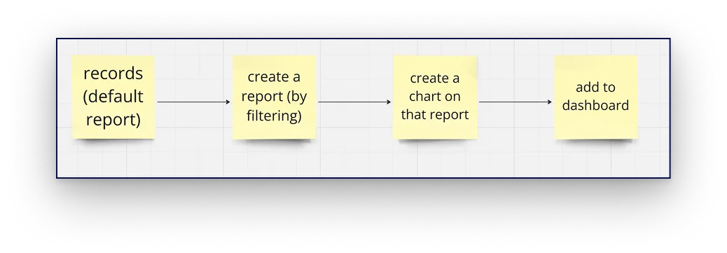
I led a cross-functional workshop to map the dashboard creation flow, which was critical in identifying the redundant "report creation" step. The four-step process looked like this: selecting record data, generating reports, building charts, and applying charts to dashboards. Through this detailed breakdown, we uncovered several friction points that created unnecessary complexity for users, and were able to propose a more intuitive, streamlined experience that reduced cognitive load and let users build dashboards more efficiently.
Defining principles
After identifying key challenges, I worked with my team to design principles that directly addressed user pain points, then aligned cross-functional stakeholders:
- Consistency to build user trust through standardized layouts, icons, and interactions
- Clarity & simplicity to reduce cognitive load with a clean, focused UI and clear hierarchy
- Accessibility to ensure full compliance with WCAG standards, critical for government users
- Actionable insights to shift from static data to meaningful trends, context, and recommendations that support decision-making
- Prioritized data to surface high-value metrics upfront with progressive disclosure, real-time updates and alerts
- Customizability to empower users to tailor views, filters, and layouts, with seamless navigation between summary and detail
These principles became the foundation for the redesign, ensuring alignment across product, design, and engineering while directly improving usability and business outcomes.
Redesigning the user flow
In the first working session, the proposal on the table was to modernize chart creation with an autosave feature. The established data architecture made that a much bigger technical lift than the value justified, so it didn't move forward. Back at the drawing board, I worked with architects to see whether refactoring the data model itself could get us a similar result within our real constraints, and a second working session is where we landed on the three-step flow below. It was less disruptive to build than autosave would have been, and ultimately a more modern, lower-friction experience for users:
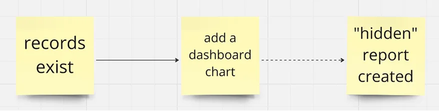
In this new process, we dropped a step in the user flow by creating a "hidden report" in the back end after the user added their record data to the dashboard card.
Updating the visual language
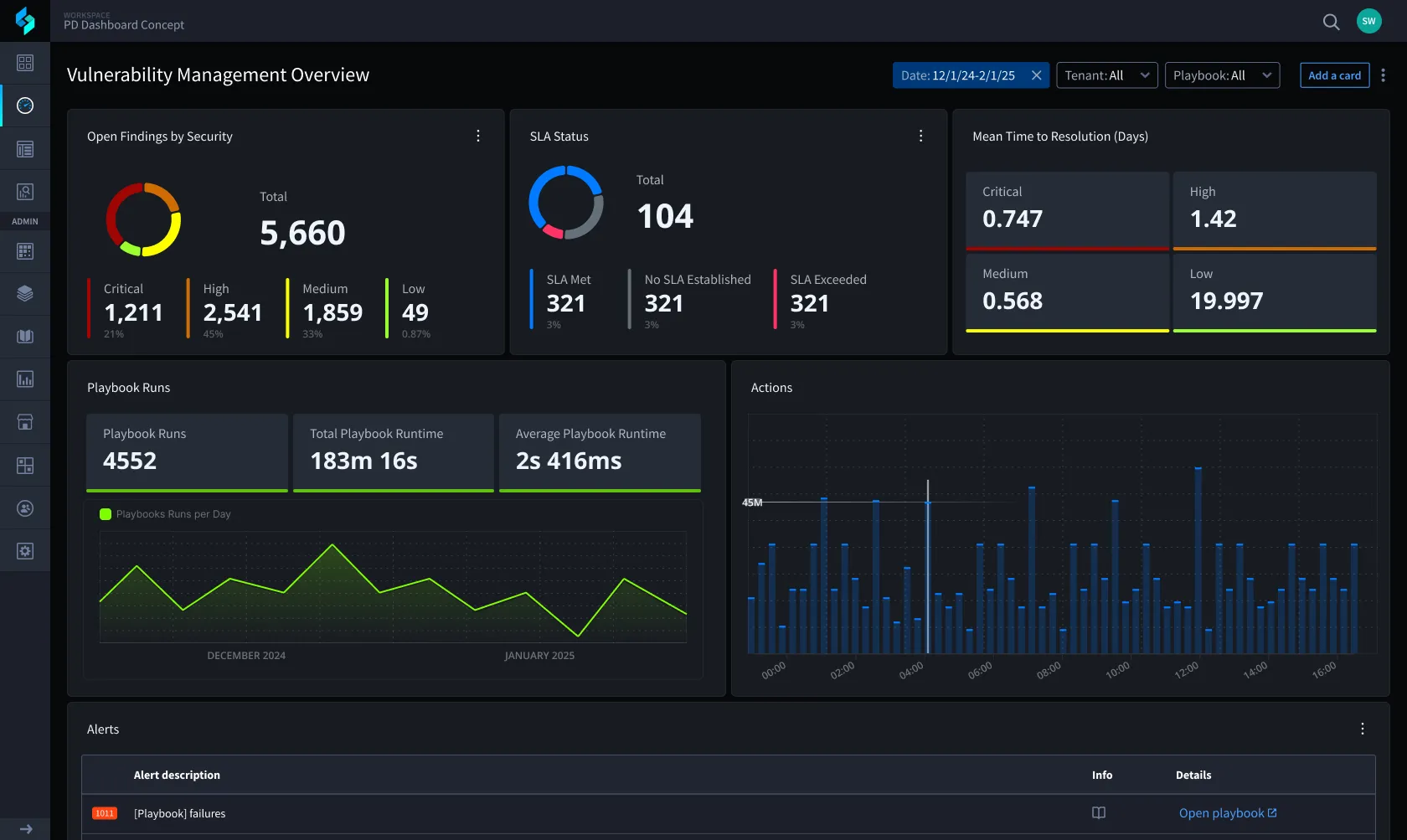
I assigned my visual designer to introduce a modern visual language that prioritized clarity, hierarchy, and usability, reducing cognitive load while supporting fast, high-confidence decision-making and conveying a more modern impression to prospects. Key elements included adding more columns to the layout for better white space and scalability. The color palette was updated to lean into the brand's tones, designed to support light and dark versions with three modes each: daily use, high contrast, and demo.
Dark mode was the default when I joined, a natural fit for security practitioners working long shifts. Light mode came later as the company grew, driven by user preference and, practically, an easier sell in the sales cycle. High contrast arrived last, added specifically to meet the accessibility bar federal customers required. None of it was planned as a three-mode system upfront; each mode earned its place by solving a real business need as it showed up.
Together, the design team created categorical, divergent, and spectral palettes along with 11 revised color scales to support all visualizations in the system, using Supa Palette to generate and compare numerous options and ensure at least AA WCAG compliance for every color.
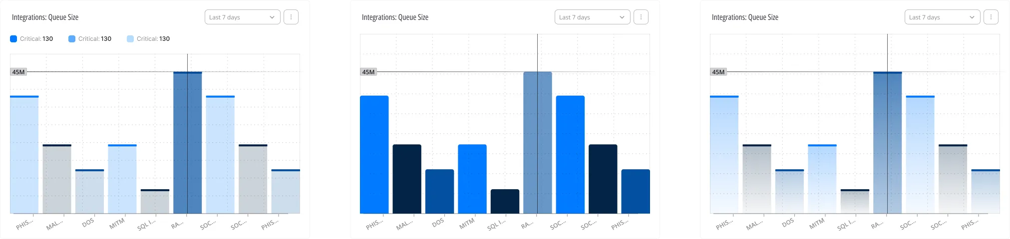
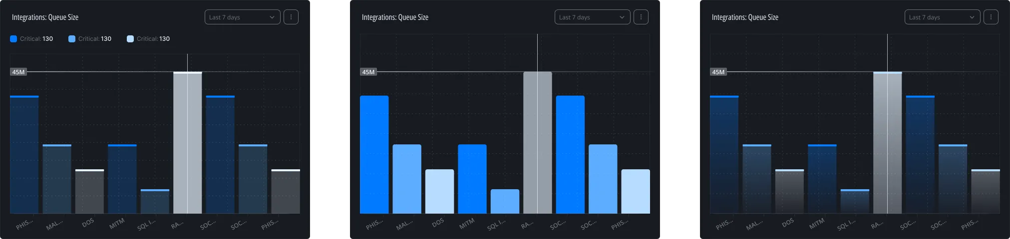
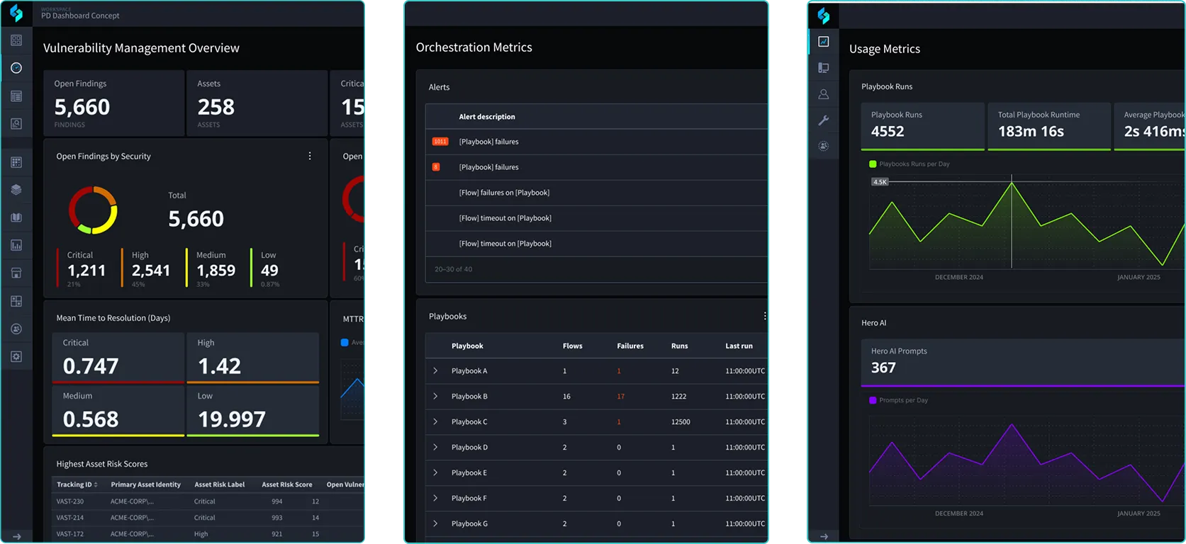
In the end, we created visual and functional consistency across all data views that helped build familiarity and reduce learning time for users.
Outcome
The modernization effort drove measurable improvements:
- Eliminated redundant report creation, enabling 35% faster dashboard creation
- Clarified chart types, data inputs, and permissions, resulting in a 20% decrease in edit and configuration errors during user testing
- Support tickets related to dashboards dropped by 19% after launch
- The hub-and-spoke design system model cut average time-to-decision by 18% across the product development lifecycle
The redesign also elevated other key data visualization features like search, filters, sort, and bulk actions, and revamped the data visualization components (bar, line, graph charts, etc.) and UI style of all charts in the design system.
Reflection
One of the hardest parts of earning alignment for the design system upgrade was getting stakeholders to let go of the perception that updating components would take more time and decrease feature velocity. I addressed this in two ways. First, I initiated regular cross-functional workshops, creating a bridge between my design team and the front-end developers. These sessions were designed to foster empathy and a shared understanding of our respective crafts, which changed how we approached sprint estimations and fostered collective ownership of our design debt.
Second, my original pitch was a full design system overhaul. I met individually with key stakeholders ahead of a leadership offsite to build support, then presented the case at the offsite itself. The reception was mixed, and the concerns were legitimate. Modernizing the system had real value, but a full overhaul carried real velocity risk relative to that value. The fallback was a phased rollout tied directly to the product roadmap: we overhauled the modules with near-term business need first, applying atomic design principles to build components that could support those modules for the next several quarters, while the rest of the product kept consuming existing components in the meantime. That compromise, shaped by the pushback and not in spite of it, did more for adoption than the original all-at-once plan would have.
Grounding the redesign in real user data was a strong signal to leadership that the investment in design was paying dividends, giving design a stronger voice in strategic conversations across the company.